1 - 10


Retail graphic system for one
of the world's largest brands.
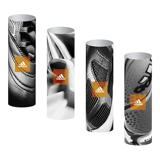
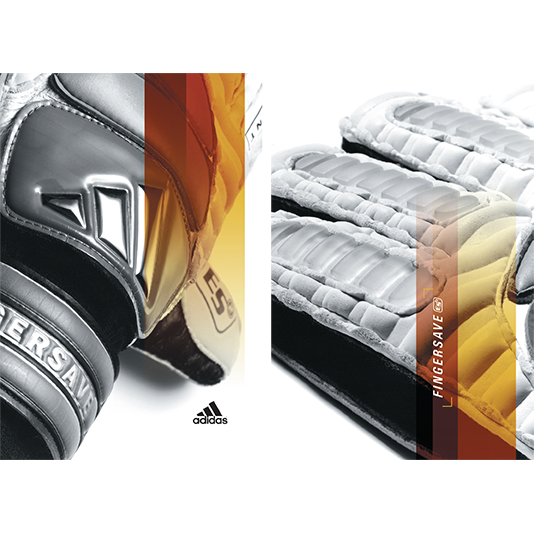
Expressive product photography
was used along with athlete
imagery to build a story all about
soccer training and the potential
benefits in performance.
Adidas is well known for its
connection to some of the
world’s best athletes. We built
visuals that capitalized on those
connections by creating a story
grounded in training and product
technology. Sculptural qualities
of the products were enhanced
via photography, adding interest
to individual characteristics
and expanding the visual story
beyond the athlete.
The first adidas stores in the US
market, Seattle and Santa Monica,
each needed its own expression
of the brand story. The training
story began in window treatments
utilizing David Beckham, and
expanded as the consumer moved
throughout the retail space.
Background graphics were printed
on a white metallic surface, and
foreground images were mounted
to acrylic and suspended on thin
metal rods.
Product imagery was mixed
in with athlete photography
alternating between windows.
This made for a nice rhythm
while providing strong visual
impact. Each window had a
black backdrop and was lit to
full dramatic effect making
for stunning visuals as day
turned to night.
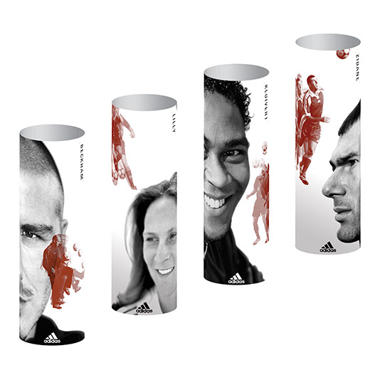
A variety of athletes were
used throughout both stores.
The global presence of these
brand ambassadors made a
strong international connection.
The Santa Monica store featured
a series of structural columns
that were part of the store’s
architecture. Athlete imagery was
printed on one side and product
on the other, and each column had
a lighting mechanism housed
within it. The resulting graphic
presentation was visually striking,
while creating a pleasant lighting
effect within the store.
The concept continued throughout
the store, each piece connecting
to the next. At the Explain level,
new product innovations were
explained through product benefit
copy, and photography emphasized
technological characteristics.
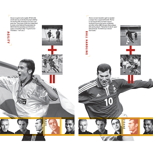
Different aspects of the training
routine expanded the product
story. Athletes were shown in
daily workout routines, game
performances, and victory
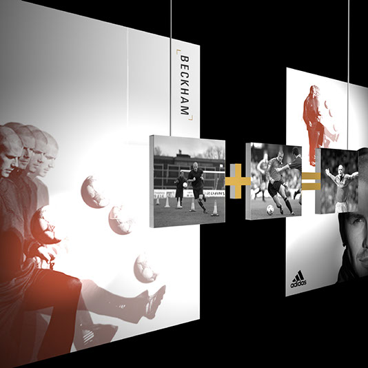
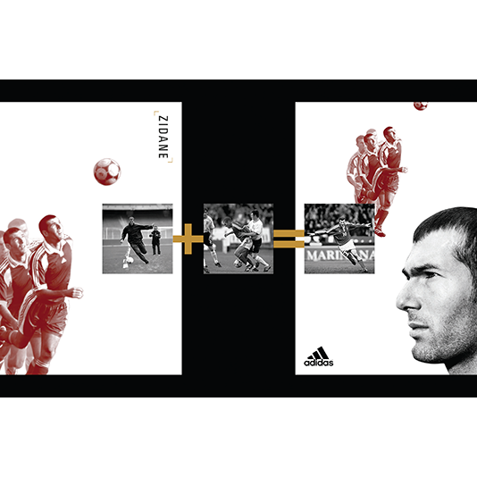
celebrations. Hard work + strong
game performances = sport at
the highest levels. This idea served
as a means to illustrate that a
committed work ethic is a key to
athletic success.
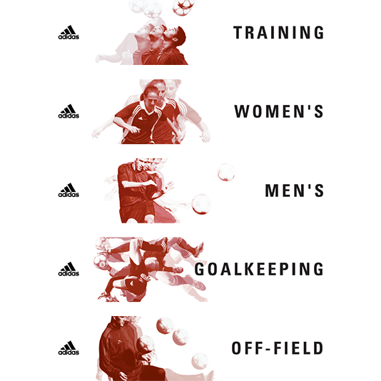
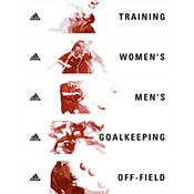
Signage was placed at eye level throughout the stores to provide
a recognizable cues for finding any
of the products quickly and easily.
<
>

When new training product was launched, adidas needed a
brand expression for its new West Coast inline stores. Up to
that point in the brand’s history, product was always part of
a shop-in-shop scenario. With the foray into branded spaces,
we created a fully immersive experience that addressed all
levels of communication with the consumer.
Based on a linear progression through the store (Announce,
Amplify, Explain), we started with the Announce level - big,
beautiful graphics intended to get attention from a distance.
As consumers moved through the store, they were provided
information through a variety of other touch points. The Amplify
level expanded the ideas of training and the features of the new
product. Reaching the perimeter of the store, the Explain level
of information provided technical benefits and drove an
informed purchase.