7 - 13



We began the project by building
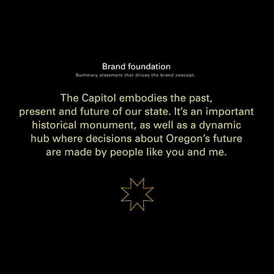
a brand plan. This part of the process consisted of distilling information from two separate
and extensive documents: the strategic plan and the interpretive plan. Both documents were
created by other agencies, and it became our task to interpret and focus this wealth of information
into something cohesive.
We created a beautiful new document which provided clarity and a stable foundation to begin building the components that would define the brand.
Developing a brand is always
about more than the way it looks.
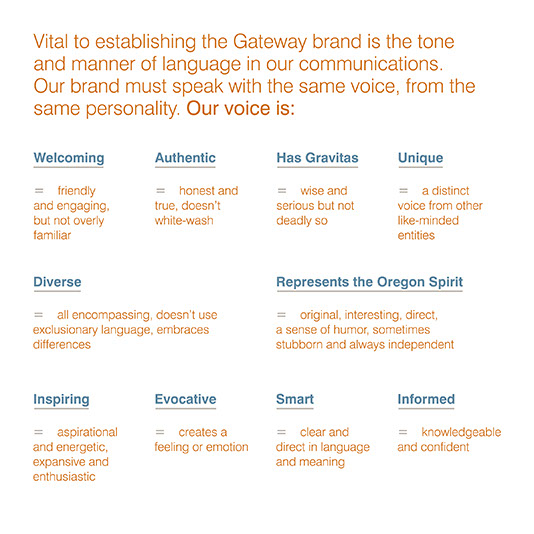
It is an all encompassing aesthetic fusing language, ideas, tone,
and visual design. Based on our research we defined key attributes which could be used as a reference and to inspire future concepts
when considering any and all
brand expressions.
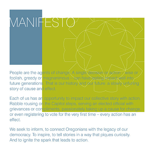
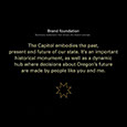
We also created a theme for the brand, ‘People are the Catalyst’,
to infuse a binding spirit and provide a core conceptual driver. From this flowed a manifesto: an inward facing message designed
to help focus the thinking for
those involved in building the brand over time.
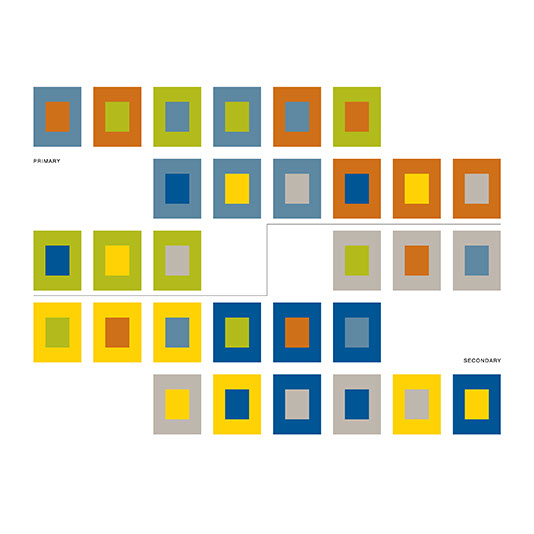
Inspired by Oregon’s natural surroundings (we have four
climate zones here) and the official state colors, Otive constructed a versatile color palette. For use in
all branded communications both primary and secondary colors
work well together, creating an opportunity for diverse represen-tation of ideas.
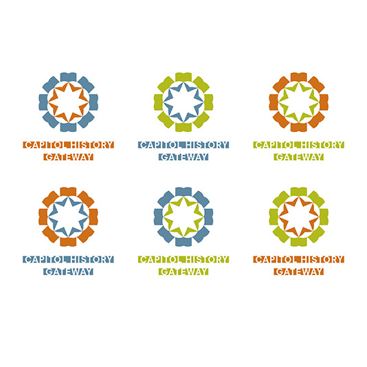
The capitol itself is adorned
with symbolism. An identity
was spawned from iconography and architectural details found throughout the public spaces.
It is strong, dynamic, and versatile. Used with primary color palette combinations the mark and corresponding typographic treatment work within a great
many communication scenarios.
It is the Capitol History Gateway brand’s signature element, and it provides value and recognition
in support of all branding efforts.
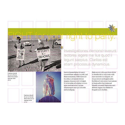
In order to establish continuity
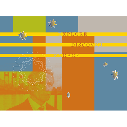
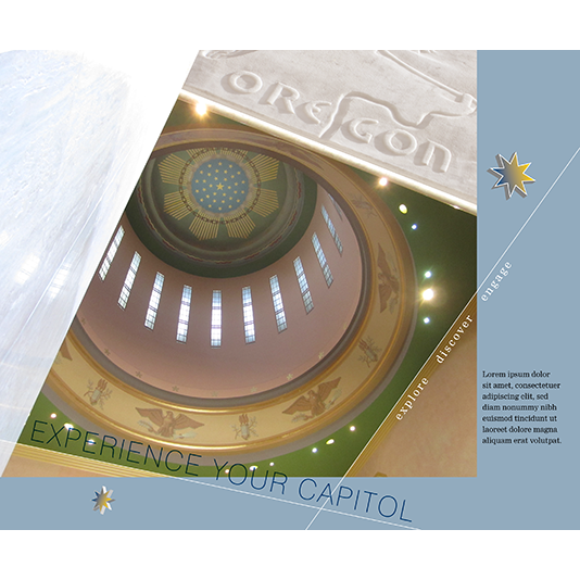
and guide designers in making layouts for all forms of commun-ication, Otive designed a grid structure for common page sizes, both vertical and horizontal orientations. We then designed a variety of sample layouts based
on the grid to illustrate how information could be organized.
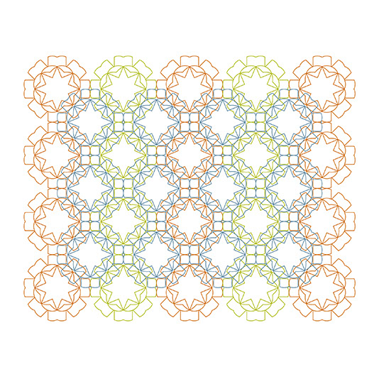
The logo mark also lends itself
well in forming a pattern. Used as an element of design flourish, the pattern creates a layer of nuance and detail when making layouts or other manifestations of the brand.
In addition to designing a
structure for the brand via
the color palette, grid system, typography, and pattern we
created a series of elements
which could be used by any designer to maintain a consistent brand voice while also allowing
for a bit of experimentation
in order to make graphics that
are dynamic and diverse.
Using a grid for every single application can feel a bit restrictive, so we created a few example
layouts to help illustrate that brand communications can be successful regardless of using a specific structure. As long as the various design elements are used wisely and the designer is working with inspired ideas, the possibilities
are vast.
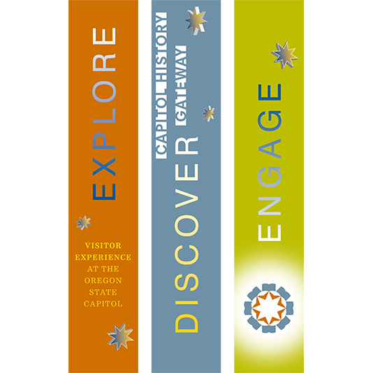
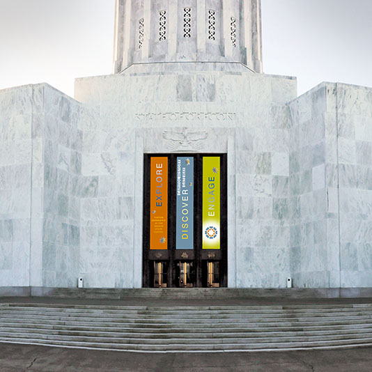
Prototype banners.
Prototype banners.
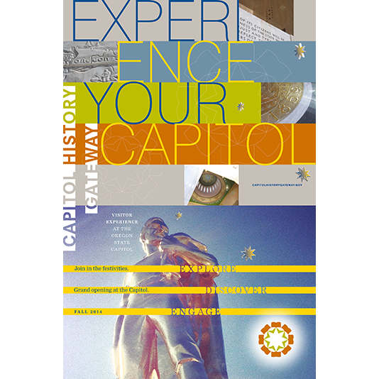
Prototype poster.
<
>
The Oregon State Capitol Foundation enlisted Otive Studio to build a new brand for the Capitol History Gateway, a conduit for people to engage with the history of the state capitol, its relationship to the state at large, and its significance in driving our citizen democracy.
The purpose of the Gateway is to frame a visitor experience which raises awareness of a rich historical context. Not only does it exist on the capitol grounds, it is also an approach that extends its reach into every community across the state. Our task was to create the starting point for that experience and provide tools necessary for building a foundation that can not only endure, it can provide
an anchor point for the application of the brand as it continues
to develop.
Through smart and inspired design, the Gateway invites people
to dive deeper into capitol history, connect with other historical organizations across the state, and discover more about Oregon’s democratic process.
