5 - 9
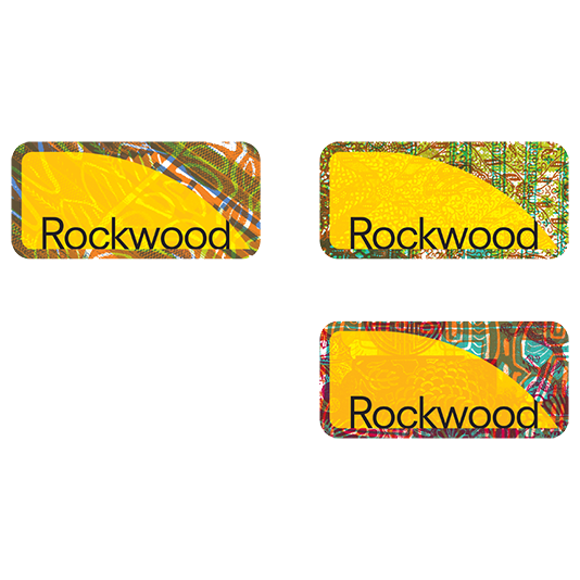


Rockwood's new identity
incorporated three new logo
versions. Each logo was created
using different fabric textures
culled from cultures around the
world. The idea being that these
textures would be combined to
make new ones and serve as
symbols to unite the newly
envisioned community.
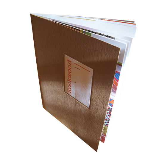
Brochures were digitally
printed and used as a tool
by the committee to aid in
soliciting funds from
potential developers.
The secondary cover served
to illustrate the idea of
combining textures in order
to build a rich and colorful
visual aesthetic that would
be recognized throughout
the community.
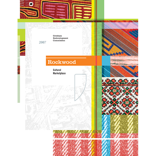
Introductory spread from the
brochure; a clean and simply
structured aesthetic was
developed in order to let the
textural elements stand out
and become the main visual narrative throughout.
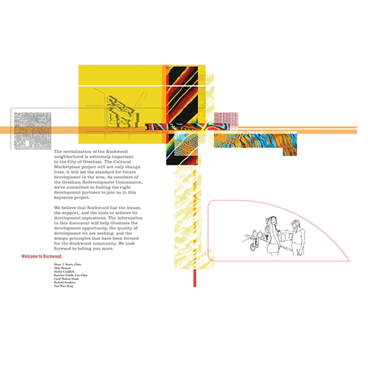
Neighborhood locations
were photographed and
used throughout the layout.
Drawings were then made
to overlay those images
communicating potential
for the future.
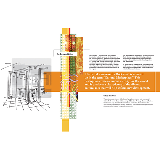
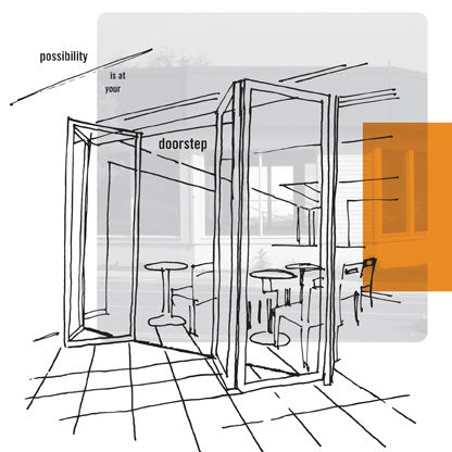
Detail from one of the
drawings showing possible
scenarios for the future.
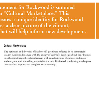
The core conceptual driver was
based on the idea of a ‘cultural
marketplace’, a space where
people could gather and share
in community. The hope was
that by giving a new identity
to Rockwood people would
notice that positive change
was happening and that their
involvement could help in
facilitating that change.
Brochure spread.
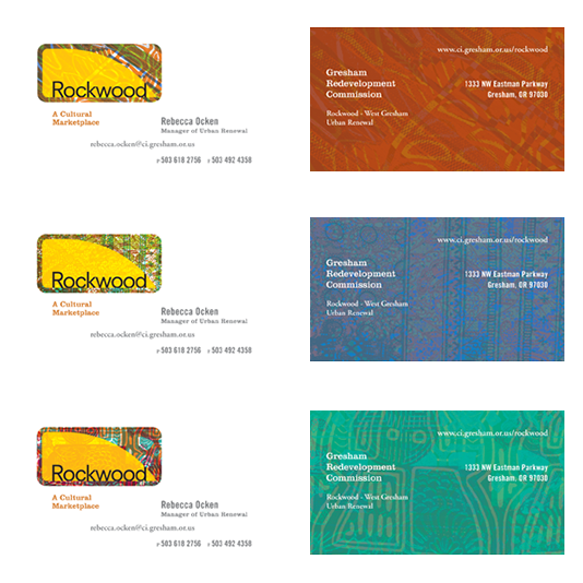
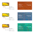
Each committee member
was given a series of 3 cards
using the new logos. Textures
were printed on the backs to
infuse visual energy and
provide a variety of options.
This tied the identity to the
diverse nature of the current
community.
<
>
Rockwood, a neighborhood in the City of Gresham, Oregon
was downtrodden and riddled with gang activity. Seeing
the need for massive change, the local government officials
decided to create a new identity for this small community.
Geographically positioned to be the gateway of the city, the
most desirable outcome was for the neighborhood to embrace
its new ethnic diversity and share in the making of a safer
and more welcoming place to live.
The initial phase involved reaching out to developers and
architects to help envision this new community. What was
needed was a communicative tool designed to share information
among those professionals enabling them to make informed
decisions. We started with a digitally printed brochure and
built the identity from there.